Tuesday, April 24, 2012
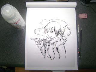
Tracks
This is for the novel Tracks by Louise Erdrich depicting the character Fleur and a Native American forest demon. It was originally created for my digital illustration class .. not completely finished yet, but I might need some feedback before I continue. But I hope to place this in the Kosar Show May 11th along with Power of the Nose.
Anyways, last day of school tomorrow!
Monday, April 23, 2012
Sunday, April 22, 2012
If you haven't done so, check out my website!!!!!!
Kathleen Joyce Website
I wanted to do a quick update of what I have been working on. I'm trying out a new technique that combines what I love about traditional and digital artwork. With traditional watercolors, I love the textures and I feel more comfortable with my drawing. I hope to one day be able to draw successfully on a tablet, but for now, I like my pen and paper. But with digital artwork, it's usually done faster and the colors can change. With traditional watercolor, once it's down, its down. I don't know if this new technique is any faster, but I feel like it's staying within my own style.
These are the pencil and watercolor tests that I might use as a bio piece for my website or something... It's supposed to be me, but I made myself look too young, time to start doing studies of old people......
These are pencils for what I'm currently working on. The first one is for the novel Tracks by Louise Erdrich. The second image is about child behavior development. I used a 9B to get the lines really dark but smooth.
These are the ink washes that help me figure out the tones of the work. The cave-family one is still being worked on.
Close-ups
Thursday, April 19, 2012
Tracks and Cave family Sketches
This is my next (and last project for school!) It's about child development and behavior problems with a historical aspect. I plan on spraying a workable fixative over it and then a wash, and finished with digital color. I'm still experimenting with this new process
These are for my digital illustration class and would go with the book Tracks by Louise Erdrich. It's supposed to be Fleur... shes evil and scary. I still have alot to fix on it.. the first image is alot looser but messy, and the second one is clean but too dry.. i have to make things more elongated and deep. I used tracing paper to trace the sketch... everything moved at one point and it ended up being chaos. Light tables are so much better... the problem is, I don't own one.
Finals to come soon!
Tuesday, April 10, 2012
Rainbows Support Group for Kids
This is a poster for Rainbows International, the Support group for kids dealing with a loss or divorce. They're popular with schools and I remember a lot of kids leaving class and coming back with all these cool projects and ceramics that I never got to do. I considered lying to be part of that group, they made cool arts and crafts in kindergarten!
Anyways, I wanted to do a positive promotional image of kids painting and interacting with each other. I'll eventually place some type and place it in a formal setup. The lines are graphite and the rest is done digitally.
I was kind of uncomfortable using an explosion of rainbow colors, I like to limit my color pallet and this image really stretched my limits to the number of colors used. I just don't like throwup art.
Wednesday, April 4, 2012
Circus Boy
This is for my digital Illustration class/ NAVS (for animals). Not many would know, but I modeled the boy after the kid from Circus Boy who later grew up to be one of the Monkeys. It was a TV show where this kid lived with a circus, I don't know too much else about it. But the theme of this project was "Speak for the Animals" and everyone else has done an ape or some type of animal with a closeup on his mouth, the mouth stitched up, or looking really sad with a closed mouth. I wanted to do a more illustrative approach that could work for a children's book.
I'm also trying something new, a hybrid of traditional and digital media. I was inspired by Corey Godbey and studied his blog to figure out how he got his images. Look him up if you haven't.
I start off with a smooth graphite and digitally color it with and overlay and multiply layer. It's so much faster this way and I still get to work traditionally. And the watercolor textures were done really loosely on cheap bristol paper (im out of paper now) with black ink and then used as a multiply layer.
Graduation coming soon!
Subscribe to:
Comments (Atom)


.jpg)
.jpg)